Cellect
Brand Book
Explore the guideLogo
Typography
Clear human language.
Headings and body copy.
Measured information.
Wordmark geometry, product and brand lines, labels and data.
The logotype is IBM Plex Mono 600 set on the face’s own monospace advance. Every letter stands on its 0.600em cell with the font’s sidebearings untouched, so the figures under the word are the ink gaps that result — not kern pairs, and not values to reproduce by hand.
Ink gaps · ce 0.120 · el 0.127 · ll 0.143 · le 0.126 · ec 0.122 · ct 0.106
Ascender 0.740 · x-height 0.516 · baseline 0 · 7 cells of 0.600em
- Face
- IBM Plex Mono
- Weight
- 600 SemiBold
- Case
- Lower case, always
- Advance
- 0.600em per character, the face's own
- Set width
- 4.200em over seven characters
- Tracking
- 0 — none, at every size
- Kerning
- None. Do not kern the logotype
- Ink
- 0.067em to 4.129em — 4.062em wide
- Ascender
- 0.740em (l)
- x-height
- 0.516em, overshoot 0.012em on c and e
- Stem
- 0.128em
- Brand line
- Plex Mono 600 caps, tracking +0.097em
- Product
- Spacing in whole or half 0.600em cells
- Delivery
- Outlines. Never retype the logotype
Mark
Motion
Wordmark → mark
Oculus → architecture
Interactions
Mark → idle
idle
listening
thinking
speaking
Agent states
Illustrations
Set-out
Separate parts, one shared reference.
Brisk assembly. A brief hold. One accent at the connection.
See it on a page ↗Intake
Incoming documents become one set of books.
Cost curve
Show actuals, budget, and the forecast beyond today.
Three parties
One source shared by sponsor, team, and investors.
Set-back
Show what is built, under way, and still taking shape.
Do
- Explain a process, relationship, or change.
- Use Paper, Ink, and one purposeful Accent.
- Assemble, hold, and return in four seconds. Keep a readable still.
Don’t
- Use tangled wireframes or literal buildings as filler.
- Animate every detail or imply illustrative curves are real results.
- Shrink labels or crop the drawing on mobile.
Color
Paper · #ECEAE3
Ink · #14161A
Accent · #BB4D36
Page conventions
Do · One reading path
Draw package
Ready for the lender.
Budget, progress and backup together.
Supporting records$25,000.00 ↗GAT-JC-101 · source record
Gator MEP Services · August 22 · $25,000.00
Matches the first row of the demo capture below.
Don’t · Competing structure
01 · Draws · Overview
Draw package
Draw package overview
DrawsPackagesOverview
Do · Distinct feature blocks
Budget
Plan the cost.
Loan draws
Assemble the backup.
Don’t · Decorative chips
Everything in one place.
BudgetPowerfulConnectedLoan drawsAll in one
Do · Readable evidence
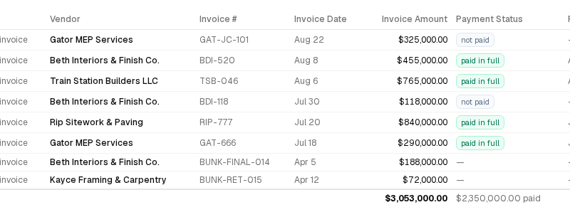
Fi payables · demo data
Open full-size capture ↗Don’t · Clipping and repetition
Invoices, invoices and more invoices.
ConventionDoDon’t
Rail
Connect a long narrative with one thin rail. Align section starts and content.
Don’t: Competing rails, decorative branches or sticky behavior that obstructs reading.
Headers
Left-align short section names; a tick is optional.
Don’t: Numbering ordinary web sections, repeating labels or showing progress markers that do not track the visible section.
Scale
Give the main idea scale and keep supporting text readable.
Don’t: Oversizing every statement or shrinking the body to fit more copy.
Pacing
Keep one main thought and its evidence together. Align comparable blocks; let content determine section height.
Don’t: Repeated explanations, decorative staggering, stranded metrics or empty bands beneath short content.
Scrolling
Use sticky section orientation and gentle section snapping. Land at the section boundary without a cropped fragment of the previous section. Show a down arrow on the opening screen.
Don’t: Hidden scroll affordances, trapped scrolling or fixed-height sections that cut off content.
Keyboard
Keep Arrow keys, Space, Page Up/Down and Home/End native. Offer Alt + ↑/↓ to move and focus between sections; preserve control keys and reduced motion.
Don’t: Hijacking reading keys, skipping long-section content, moving without focus or trapping Tab.
First screen
Fit the complete hero—navigation, headline, supporting copy, action and scroll cue—inside the opening viewport. Size by height as well as width; test short laptops and phone landscape.
Don’t: Width-only hero type, clipped final lines or a call to action below the fold. Allow natural scrolling for enlarged text and unusually constrained windows rather than hiding content.
Hierarchy
Keep the title larger than section headings. Let specimens lead and keep specifications nearby.
Don’t: Chapter titles competing with the cover or tiny samples in oversized panels.
Mobile
Put the heading and context before long figures in both mobile layout and source order. Recompose diagrams, keep text legible and touch targets at least 44px.
Don’t: Scaled-down desktop diagrams, delayed explanations, oversized hero gaps or sticky headers covering content.
Chips
Use chips for filters, selections or meaningful status.
Don’t: Decorative pills around capabilities, slogans or sentences.
Blocks
Group distinct features, choices or outputs in simple blocks.
Don’t: A card around every paragraph or the same card grid throughout.
Lines
Use thin borders to clarify relationships and boundaries.
Don’t: Dividing every paragraph or adding lines for texture.
Figures
Give each figure a distinct purpose. Pair verified outcomes with supporting product evidence.
Don’t: Repeated prose in diagram form, unsupported outcomes or internal counts that do not help the reader.
Screenshots
Crop to the task with readable content and sensible margins.
Don’t: Clipped text, tiny dashboards or copy that repeats the screenshot.
Motion
Animate a meaningful process: assemble, check, approve, return. Use stable framing and hold the completed state long enough to read.
Don’t: Busy ambient effects, arbitrary morphs or motion that restarts before the outcome can be understood.
Copy
Use short, self-sufficient headings. Every section adds a new fact or advances the story.
Don’t: Repeated captions, filler taglines or agents in every sentence.
Presence
Use the wordmark confidently. Give the mark a purpose.
Don’t: Automatically adding the mark to every logo, hero or screen.
Brand motion loops calmly.
Explainers have playback controls.
Page reveals follow reading order.
On mobile, simplify the rail and let sections grow to fit.
Before publishing
- Judge rendered scroll sequences separately from token and behavior compliance. Capture desktop and phone viewport slices; inspect gaps, paired columns, case-study evidence and the close before scoring.
- Put context before long figures in visual and source order. At phone width the section heading appears before the diagram; text remains legible without sideways scrolling.
- Align comparable blocks, compose metrics with their story and size the close to its content. Review complete viewports; no stranded evidence, unexplained progress boxes or persistent prototype controls.
- Budget the complete first screen against the available viewport height. At 1366×768, 1440×900, 1920×1080 and phone portrait/landscape, the whole headline, CTA and down arrow are visible; enlarged text remains reachable without clipping.
- Preserve native reading keys and provide optional focused section shortcuts. Alt + Up/Down moves between sections; Tab reaches content; controls retain their keys; long sections stay readable and reduced motion is instant.
- Preserve essential metadata at every breakpoint and separate labels from their evidence. Download format is visible on mobile; labels and linked amounts have distinct lines.
- Demonstrate the rule with real product captures and explicitly labeled sample records. Linked amounts match source references; cropped captures remain inspectable at full size.
- Provide pause, replay and a static reduced-motion specimen. Pause freezes the specimen, replay restarts it and reduced motion never animates.
- Name downloads by composition: wordmark, mark + wordmark, product and size. A reader can select the correct asset without opening several files.
- Title > section > specimen label; the actual specimen may be large. Compare computed sizes and a screenshot with adjacent heading levels.
- Specimen scale must survive the CSS cascade; spacing follows the content. Inspect rendered Sans and Mono samples, not only stylesheet values.
- Use a quiet desktop index with current location; a full-screen mobile contents panel. Open, select, close and keyboard-navigate on desktop and narrow screens.
- Frame the object only where meaningful; pair comparisons with a shared row rule. Remove borders that do not express a relationship.
- Provide an opening down arrow, sticky orientation and gentle section snapping. Arrow works; long sections remain reachable; sticky headers never cover anchored content.
- One main thought plus useful evidence at a time; concise copy without dead space. Review whole viewports, not isolated components.
- Verify 375, 390 and 430px widths, landscape and reduced motion. No page overflow, clipped text, inaccessible links or touch targets below 44px.
Visual references
Borrow selectively. These are not alternate brand systems or approved product copy.
- p57 · Identity, hero scale and continuous rail
- p6 · Spacing and thin borders
- p7 · Blocks along a rail; omit the coupon
- p9 · Figure presentation
- p10 · A continuous reading path
- p1 · Scale
- p41 · Boldness
- p45 · Changes in scale
Do not carry forward p57’s tiny labels, long gaps, repeated copy or older product naming.
Interface specimens
| Account | Actual | Budget |
|---|---|---|
| Revenue | 120,000 | 125,000 |
| Operating costs | (42,000) | (40,000) |
| Net operating income | 78,000 | 85,000 |
Page composition
Scroll inside the specimen. Follow the amount to its source.
Use
Do
- Use the supplied outlined assets.
- Keep Fi in the product lockup.
- Set Fund Build Book beneath Cellect without Fi.
- Use one ink across the entire mark.
- Keep the outer ring fixed in state motion.
- Use calm timing and support reduced motion.
Don’t
- Retype or redraw the logo.
- Set Fund, Build, or Book as superscripts.
- Split the mark into multiple colors.
- Stretch, crop, rotate or decorate the mark.
- Morph the outer ring or add new parts.
- Use bounce, speed alone, or progress-bar motion to show state.
Assets
TAR.GZIllustration sourceTAR.GZ · Complete downloadable packageTAR.GZJSONIllustration usageJSON · Agent-readable guidanceJSON MarkSVG · Standalone symbolSVG
 Mark reversedSVG · Symbol on dark surfacesSVG
 WordmarkSVG · Company signatureSVG
 Wordmark · FiSVG · Product signatureSVG
 Wordmark · Fund Build BookSVG · Company signature with brand lineSVG
 Mark + wordmarkSVG · Combined symbol and company nameSVG
 Mark + wordmark · FiSVG · Combined product signatureSVG
 Mark + wordmark · Fi · smallSVG · Small-size product signatureSVG
 Mark + wordmark · Fund Build BookSVG · Combined signature with brand lineSVG
 App iconsTAR.GZ · Favicon, iOS and app sizesTAR.GZLINKProduct explainerLINK · Reference pageLINKJSONDesign review checklistJSON · Agent-readable guidanceJSONMDAgent briefMD · Agent-readable guidanceMDTXTAgent indexTXT · Agent-readable guidanceTXTJSONBrand tokensJSON · Agent-readable guidanceJSONTAR.GZAll assetsTAR.GZ · Complete downloadable packageTAR.GZ
MarkSVG · Standalone symbolSVGMark reversedSVG · Symbol on dark surfacesSVGWordmarkSVG · Company signatureSVGWordmark · FiSVG · Product signatureSVGWordmark · Fund Build BookSVG · Company signature with brand lineSVGMark + wordmarkSVG · Combined symbol and company nameSVGMark + wordmark · FiSVG · Combined product signatureSVGMark + wordmark · Fi · smallSVG · Small-size product signatureSVGMark + wordmark · Fund Build BookSVG · Combined signature with brand lineSVGApp iconsTAR.GZ · Favicon, iOS and app sizesTAR.GZLINKProduct explainerLINK · Reference pageLINKJSONDesign review checklistJSON · Agent-readable guidanceJSONMDAgent briefMD · Agent-readable guidanceMDTXTAgent indexTXT · Agent-readable guidanceTXTJSONBrand tokensJSON · Agent-readable guidanceJSONTAR.GZAll assetsTAR.GZ · Complete downloadable packageTAR.GZ